Good design is not just what it looks like, but what it does. – Steve Jobs
Logos and Typography
As a graphic designer, I understand the essential role that strong visuals play in shaping how a brand or organization is perceived. Design is not only about aesthetics; it is about creating a clear identity that communicates values, tells a story, and leaves a lasting impression.
I approach every project with a balance of creativity and strategy, crafting designs that are purposeful, engaging, and aligned with the goals of the brand. Whether it is a bold logo, thoughtful typography, or a full digital experience, I focus on building visuals that connect with audiences and stand out across platforms.
This portfolio highlights work in visual identity and design, reflecting my commitment to delivering professional, impactful, and meaningful creative solutions. I welcome the opportunity to bring your vision to life through design that inspires and endures.
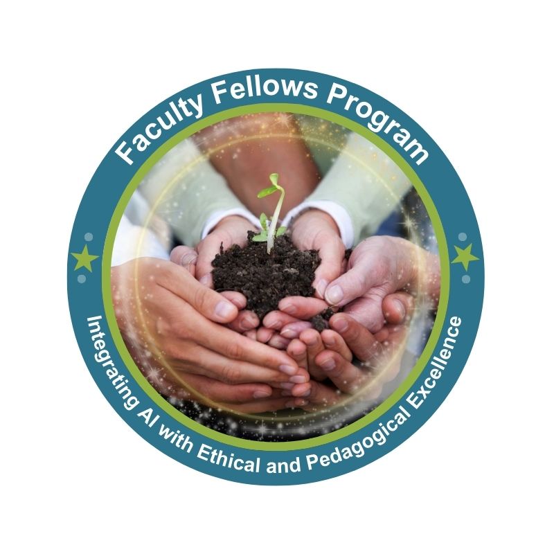
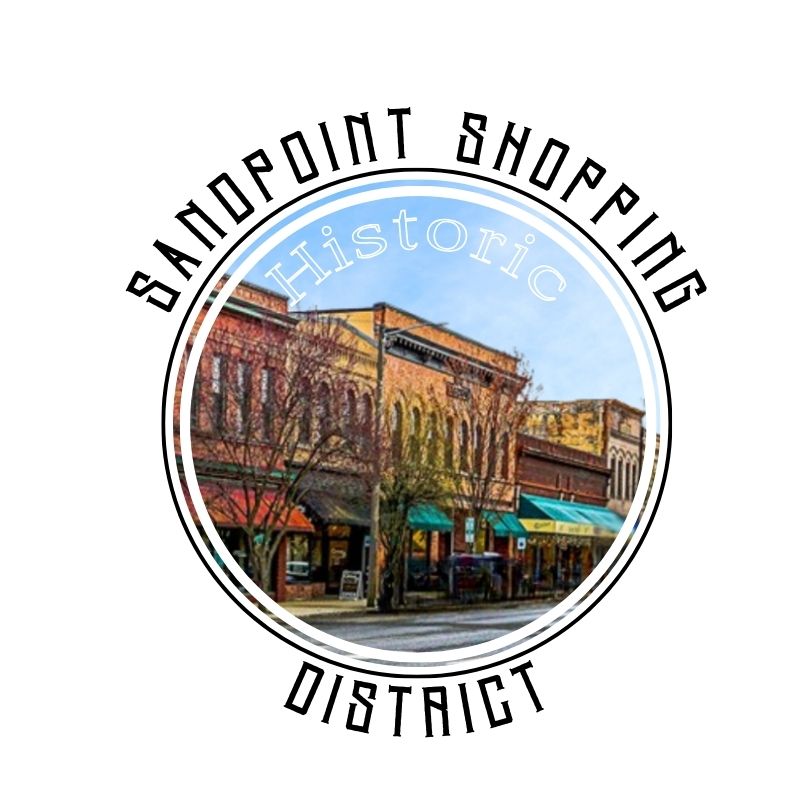
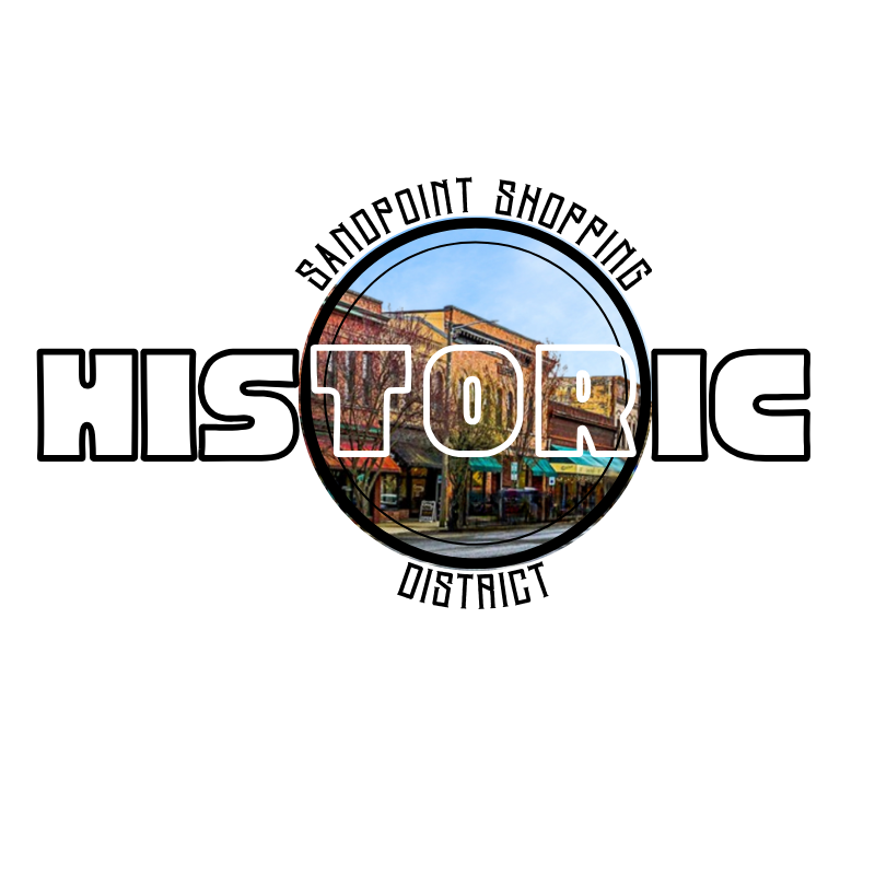
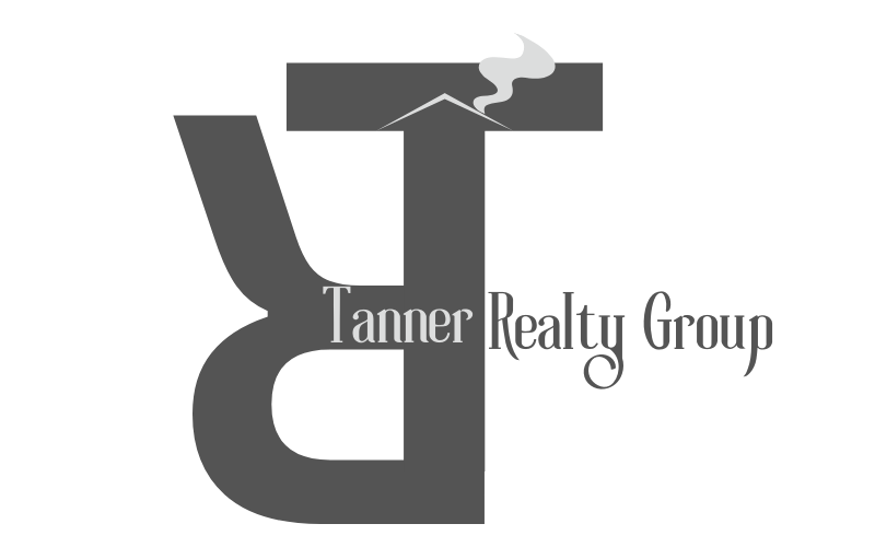
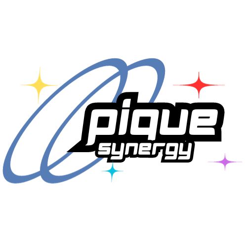
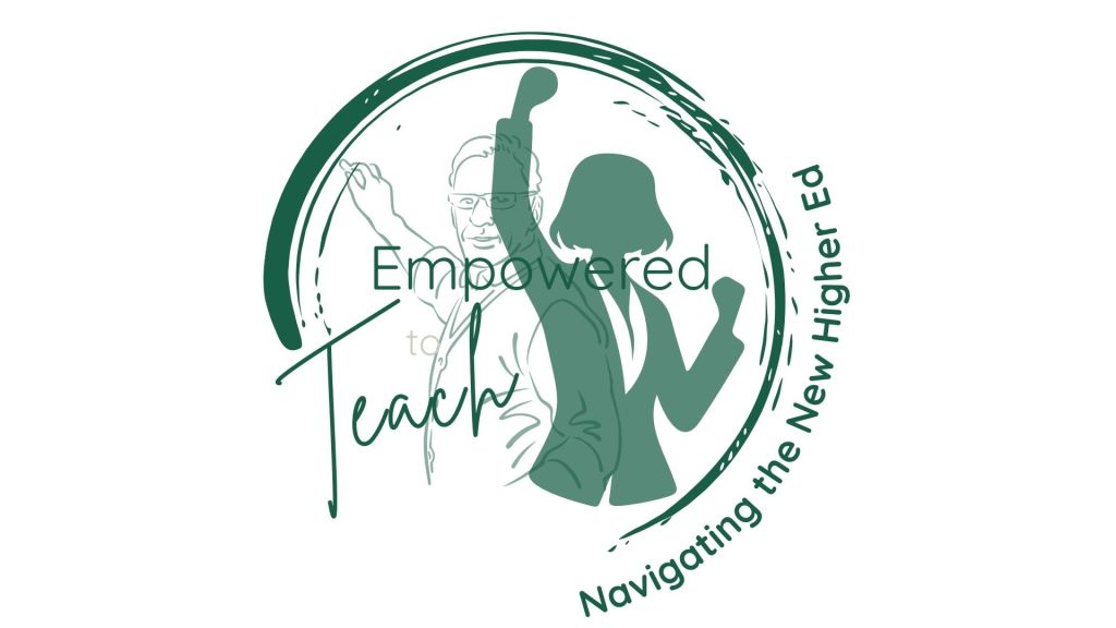
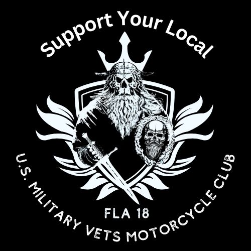
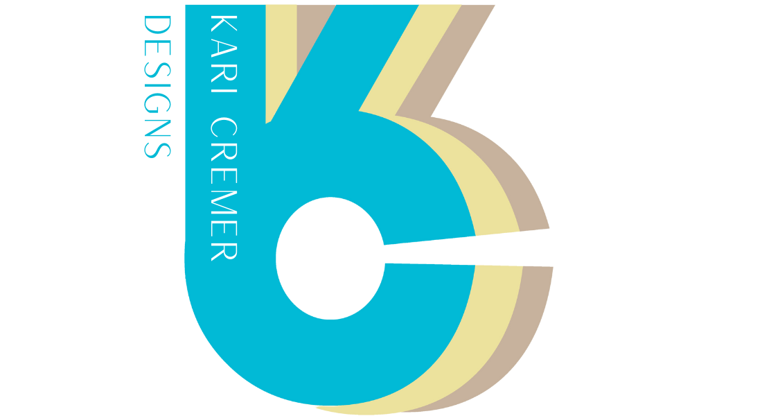
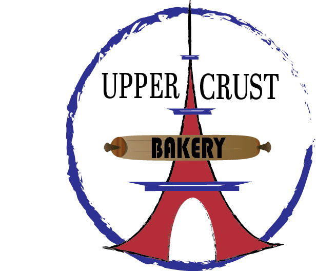
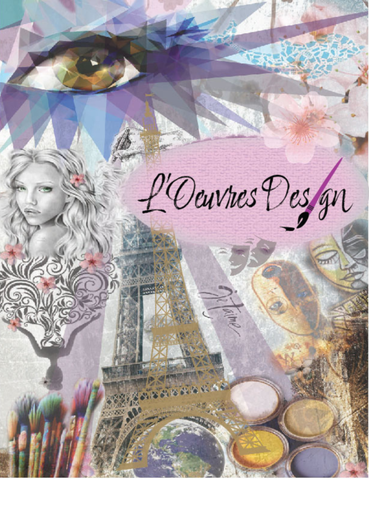
Faculty Fellows Program Logo – This logo was created for the Faculty Fellows Program, a new initiative supporting faculty development with a focus on integrating AI into teaching with ethical and pedagogical excellence. The design features several hands holding soil with a plant sprouting, symbolizing collaboration, shared responsibility, and the growth of new ideas. The logo was featured on the program’s faculty website, landing page, and across all supporting materials, creating a consistent and recognizable visual identity.Historic Sandpoint Shopping District – Shown below are several design variations created during the logo development process for the Historic Sandpoint, Idaho Shopping District, highlighting different directions explored before final selection. Design #1 was the option ultimately chosenSimulated Experiences Logo – This logo was created for the Simulated Experiences Department at Saint Leo University, which supports simulation-based learning. Along with developing a new website for the department, I designed a fresh visual identity to represent its innovative and technology-driven focus. The logo features a smaller profile image nested within a larger male profile, with a trail of pixelation to symbolize simulation, digital environments, and the integration of technology into educationTanner Realty Group – This logo was created for Tanner Realty Group, who requested a black-and-white design with a subtle, abstract house element. To achieve this, I used various shades of gray and incorporated the group’s initials, TR. The R was flipped upside down and combined with the T to form the outline of a house, creating a modern and minimal mark that reflects both the real estate focus and the brand’s identity.This logo was created for a Vice President at Saint Leo University to represent a new micro course on the Ethical Use of Artificial Intelligence, developed in collaboration with Hillsborough Community College. To reflect the partnership, I designed a visual identity that combined the mascots of both institutions, Saint Leo University’s lion and Hillsborough’s eagle, into a single mark. The result symbolizes collaboration, strength, and a shared commitment to advancing ethical AI education.This logo was created for Saint Leo University’s AI Literacy course, designed to support faculty and staff in developing essential knowledge of artificial intelligence. I incorporated the university’s brand marketing colors to ensure consistency with existing visual identity standards. The design features a simple, clean infographic-style element that represents an online course, reflecting clarity, accessibility, and modern digital learning.This logo was created for a software company that wanted a design with a distinctive look to set it apart from competitors. I chose a style inspired by the 1950s, incorporating whimsical typography, playful circle elements, and retro star accents with a touch of color. The result is a simple yet memorable design that conveys both professionalism and a sense of funEmpowered to Teach: Navigating the New Higher Ed (Event Logo) – A half-circle logo featuring layered silhouettes of a teacher at a chalkboard and a celebratory figure, paired with clean sans serif and cursive typography. The event theme curves along the edge, unified by a monochromatic color palette with tonal variations.U.S. Military Vets Motorcycle Club (Logo Design) Created an edgy, monochromatic logo featuring a phantom raider-style mascot with a sword, set over a bar and shield to evoke military symbolism. The image was designed in white to stand out on black merchandise, with a rugged, masculine font encircling the design. This logo is used across the club’s website, Facebook page, and merchandise.Deeper Dive into Hybrid Course Development (Course Logo Design) Designed a course logo using the established course color theme of dark and light blue, consistent with the branding of the course series. A central light blue circle features interwoven infographic elements, surrounded by layered dotted rings to evoke both a digital aesthetic and the theme of bubbles. A white silhouette of a scuba diver at the top right reinforces the “deeper dive” concept.KC Design Brand Logo Created a personal brand logo combining my initials K and C into a unified three-dimensional design. The layered color palette of bright turquoise, sun-washed yellow with a slight brown tint, and sand was chosen to reflect my love of the beach and surf culture in Florida.Upper Crust French Bakery (Logo Design, Student Project) Created a logo concept for a fictitious French bakery, Upper Crust, while in design school. The design features the Eiffel Tower with the colors of the French flag, accented by a rolling pin across the tower bearing the word “Bakery.” The brand name Upper Crust is set in a traditional serif font to evoke an old-world, authentic French style.L’Oeuvres Design (Personal Logo Project, Student Work) Developed a personal logo and collage concept under the name L’Oeuvres Design (French for “The Works of Art”) to represent my French heritage and creative identity. The collage incorporated meaningful imagery including the Eiffel Tower, pink cherry blossoms, a sketch of a young girl reminiscent of my daughter, paints and brushes, and a large eye, a recurring subject in my sketches and a symbol of my artistic focus.