As a graphic designer, I understand the essential role that strong visuals play in shaping how a brand or organization is perceived. Design is not only about aesthetics; it is about creating a clear identity that communicates values, tells a story, and leaves a lasting impression.
I approach every project with a balance of creativity and strategy, crafting designs that are purposeful, engaging, and aligned with the goals of the brand. Whether it is a bold logo, thoughtful typography, or a full digital experience, I focus on building visuals that connect with audiences and stand out across platforms.
This portfolio highlights work in visual identity and design, reflecting my commitment to delivering professional, impactful, and meaningful creative solutions. I welcome the opportunity to bring your vision to life through design that inspires and endures.
This design centers on a heart-shaped emblem that symbolizes compassion and professional support. Within the heart, the silhouettes of an elderly couple are framed by a protective purple hand, representing the safety and personal attention provided by the company. A third figure stands above them to signify the dedicated presence of a caregiver. The vibrant purple and gold palette establishes a balance of trust and warmth, while the bold, clean typography ensures the business name is professional and easy to read.
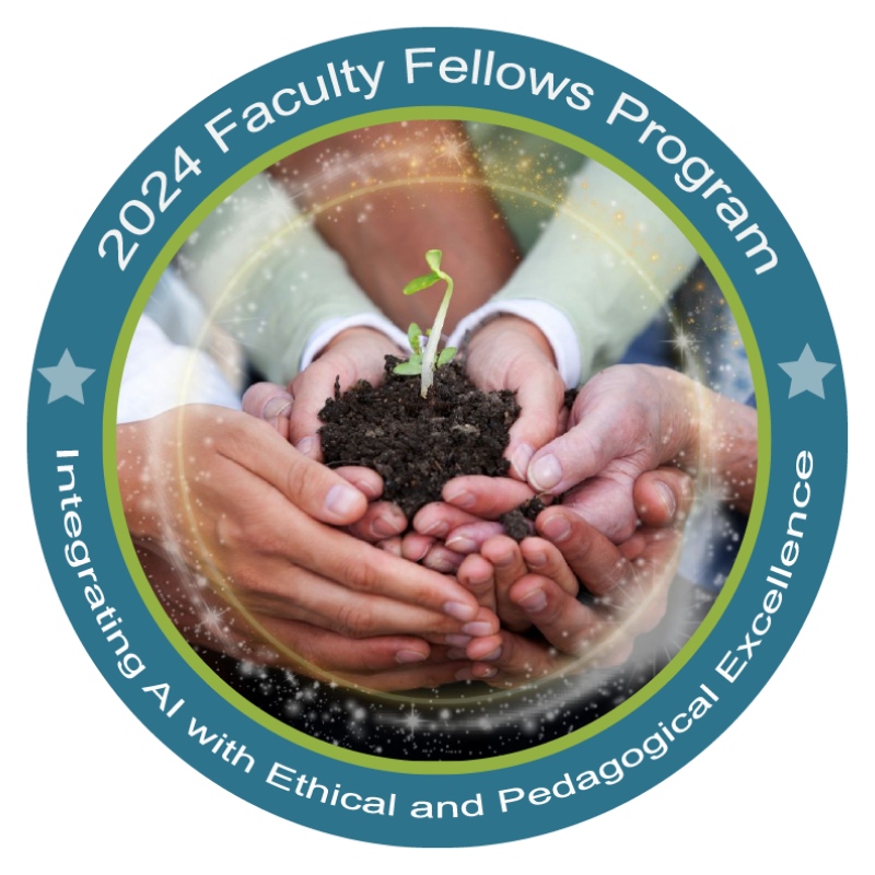
Faculty Fellows Program
This design features a central image of diverse hands cradling a growing seedling to represent unity and the collaborative growth of the program. A shimmering light effect surrounds the hands, symbolizing the integration of AI as a modern tool for innovation. The circular badge is framed by a teal and green border that clearly identifies the program’s mission to combine technological advancement with ethical and pedagogical excellence.
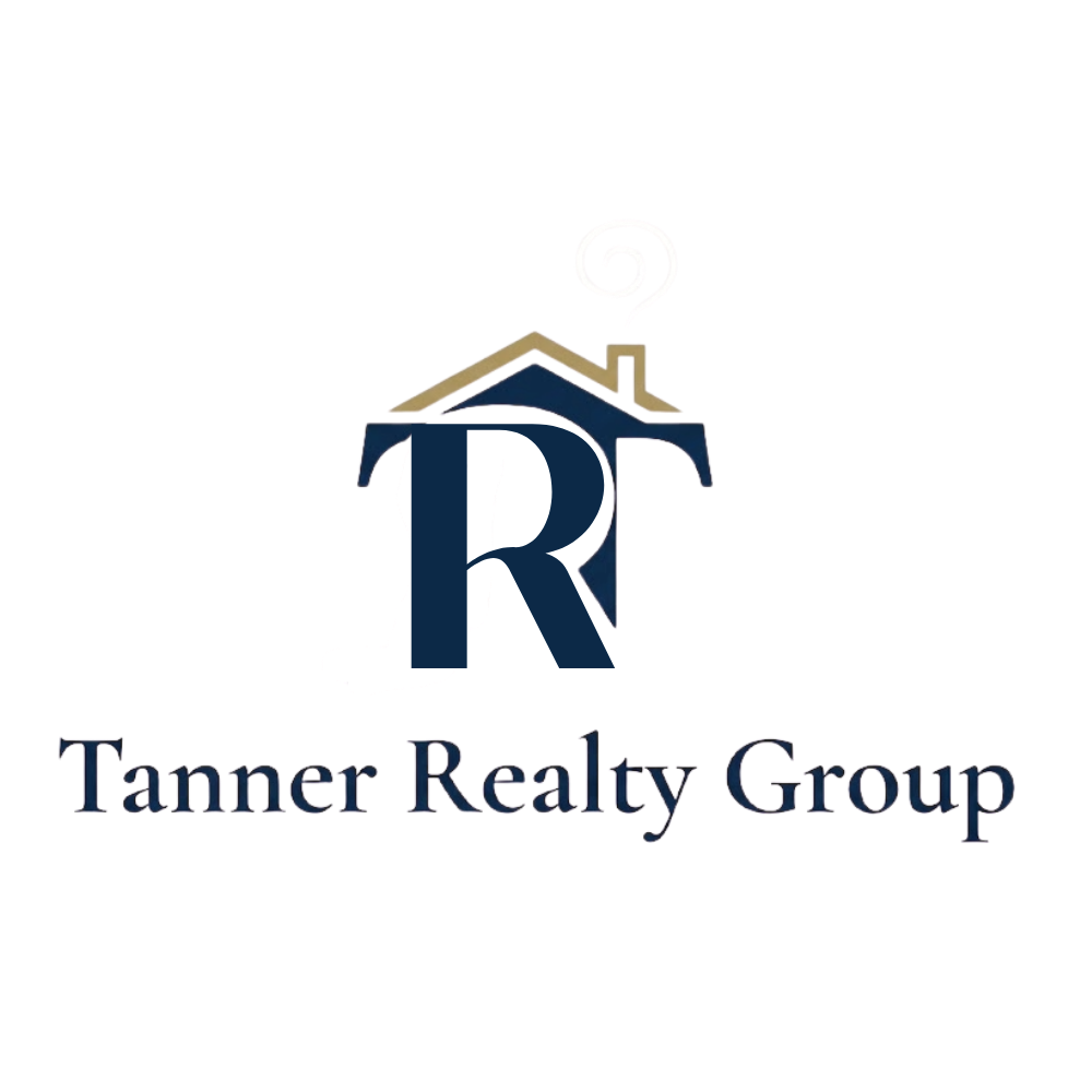
This logo was created for Tanner Realty Group, which requested a black-and-white design with a subtle, abstract house element. To achieve this, I used various shades of gray and incorporated the group’s initials, TR. The R was flipped upside down and combined with the T to form the outline of a house, creating a modern and minimal mark that reflects both the real estate focus and the brand’s identity.

This logo was created for a software company that wanted a design with a distinctive look to set it apart from competitors. I chose a style inspired by the 1950s, incorporating whimsical typography, playful circle elements, and retro star accents with a touch of color. The result is a simple yet memorable design that conveys both professionalism and a sense of fun
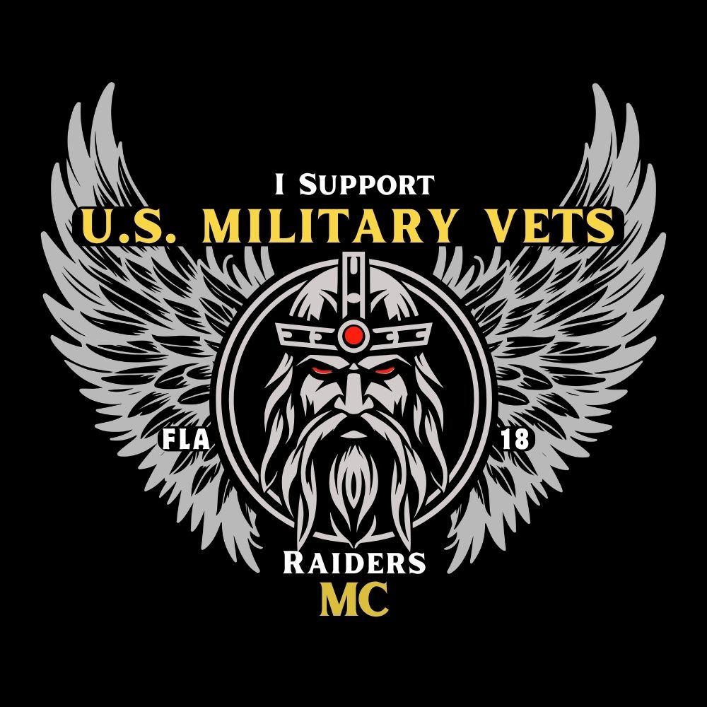
The central medieval raider is a literal visual for the Raiders MC name. It is framed by large grey wings to symbolize freedom and strength on the road. The phrasing I Support U.S. Military Vets is integrated directly into the layout. High-contrast gold and red accents ensure the emblem is sharp and legible for apparel.

Designed a course logo using the established course color theme of dark and light blue, consistent with the branding of the course series. A central light blue circle features interwoven infographic elements, surrounded by layered dotted rings to evoke both a digital aesthetic and the theme of bubbles. A white silhouette of a scuba diver at the top right reinforces the “deeper dive” concept.
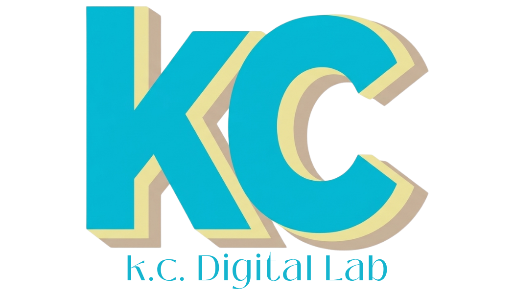
The visual identity for KC Digital Lab was built to bridge the gap between technical web development and high-impact graphic artistry. The central mark features a bold integrated monogram that serves as a stable anchor for the brand. By using a vibrant turquoise for both the graphic and the lowercase lettering, the design achieves a seamless sense of unity. The offset cream shadows add a retro dimensional quality that suggests a hands-on creative process, while the lowercase typography keeps the brand feeling approachable and collaborative for every client.
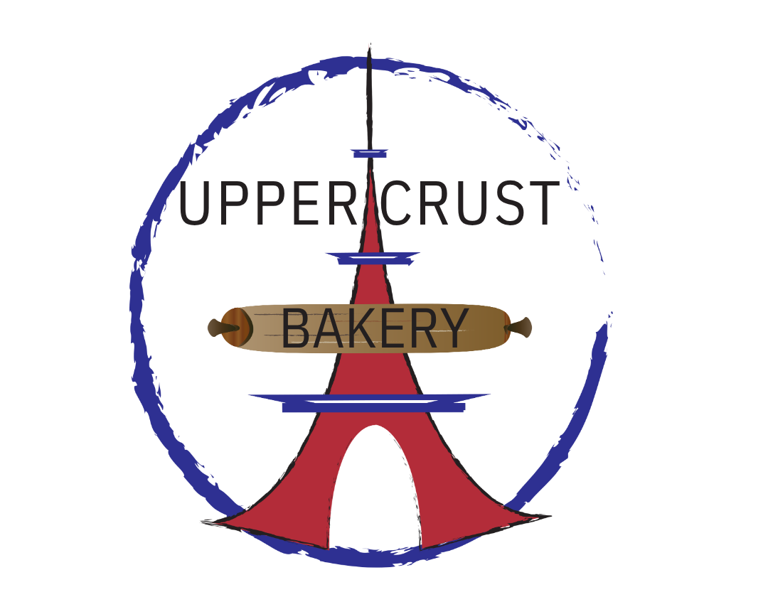
Created a logo concept for a fictitious French bakery, Upper Crust, while in design school. The design features the Eiffel Tower with the colors of the French flag, accented by a rolling pin across the tower bearing the word “Bakery.” The brand name Upper Crust is set in a traditional serif font to evoke an old-world, authentic French style.
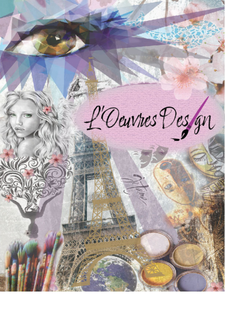
Developed a personal logo and collage concept under the name L’Oeuvres Design (French for “The Works of Art”) to represent my French heritage and creative identity. The collage incorporated meaningful imagery, including the Eiffel Tower, pink cherry blossoms, a sketch of a young girl reminiscent of my daughter, paints and brushes, and a large eye, a recurring subject in my sketches and a symbol of my artistic focus.
