Good design is not just what it looks like, but what it does. – Steve Jobs
Print Design
About My Designs
This collection showcases a variety of print designs created for campaigns, events, annual reports, and more. Many of these pieces were developed while following Saint Leo University’s brand identity guidelines, ensuring consistency in color, typography, and style. In addition to my work for the university, I have also created flyers, magazines, menus, and other materials for external clients and organizations, further highlighting my versatility and ability to adapt to different branding standards. Each design reflects a careful balance of creativity and professionalism, tailored to meet the needs of diverse audiences and objectives.
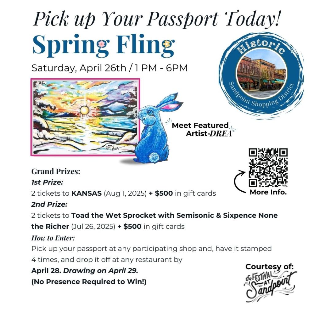
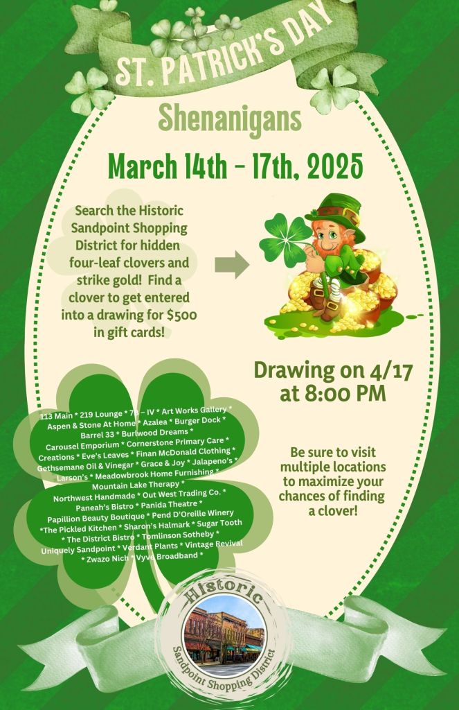
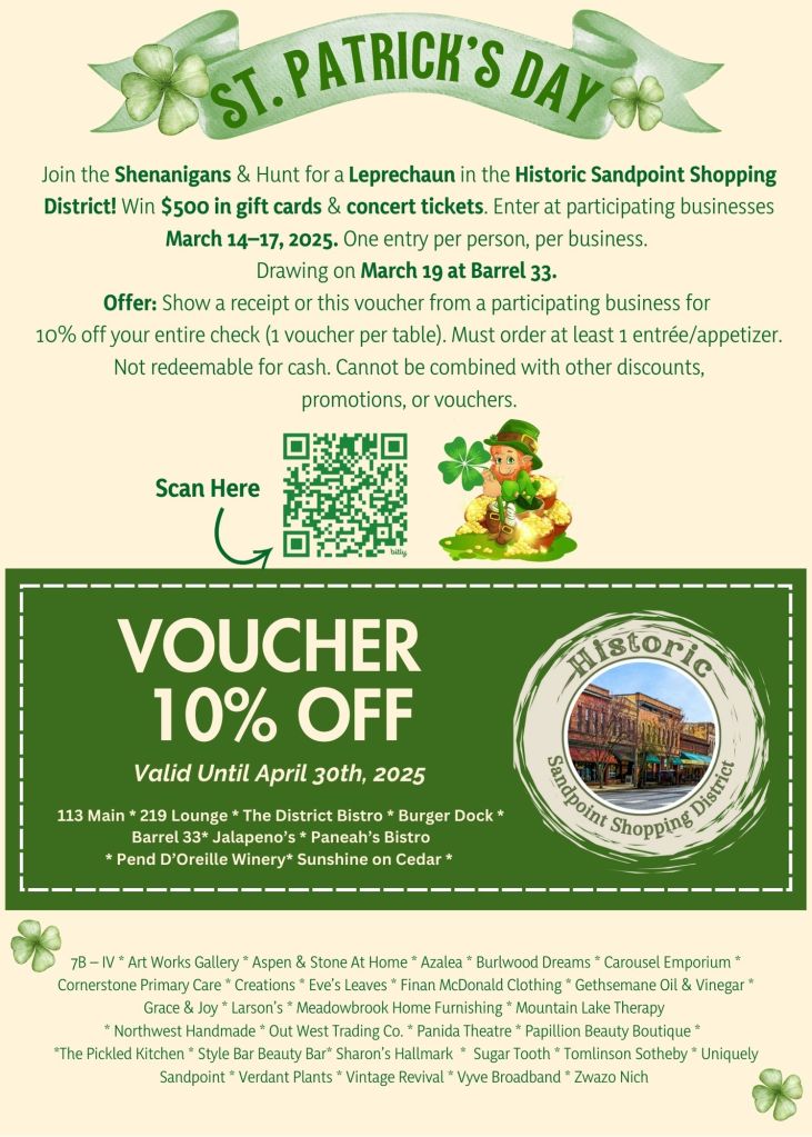
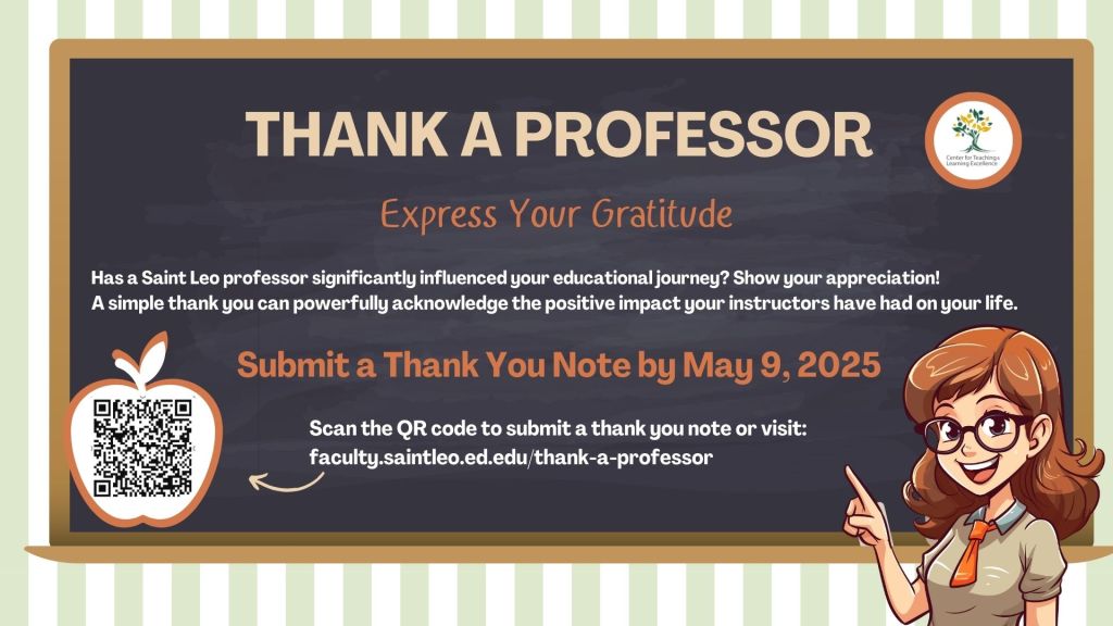
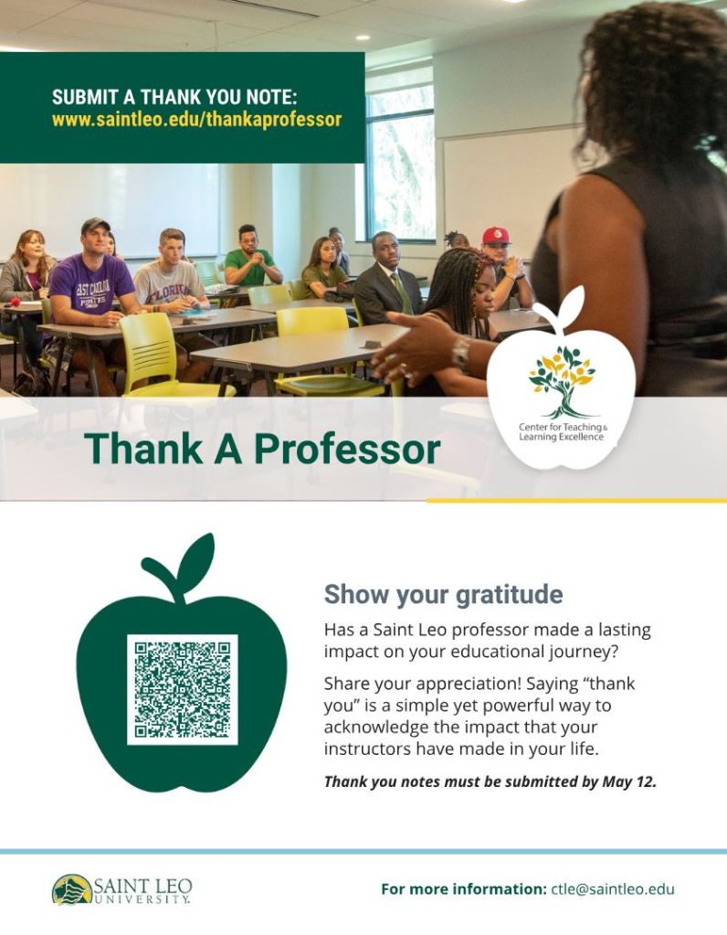
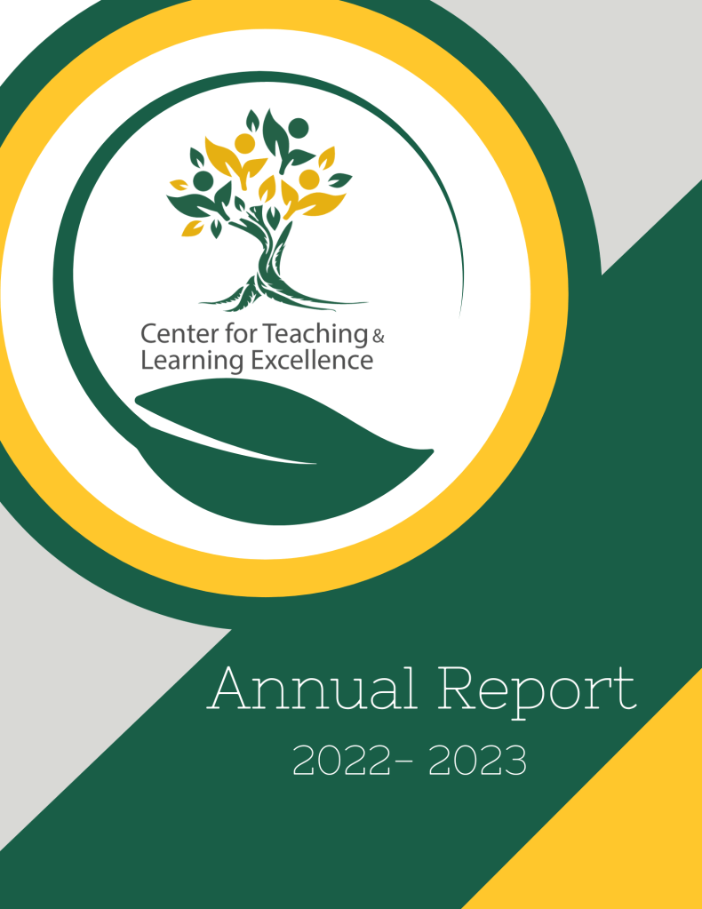
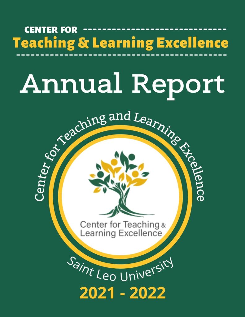
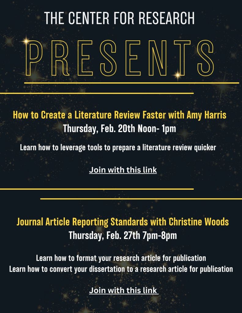
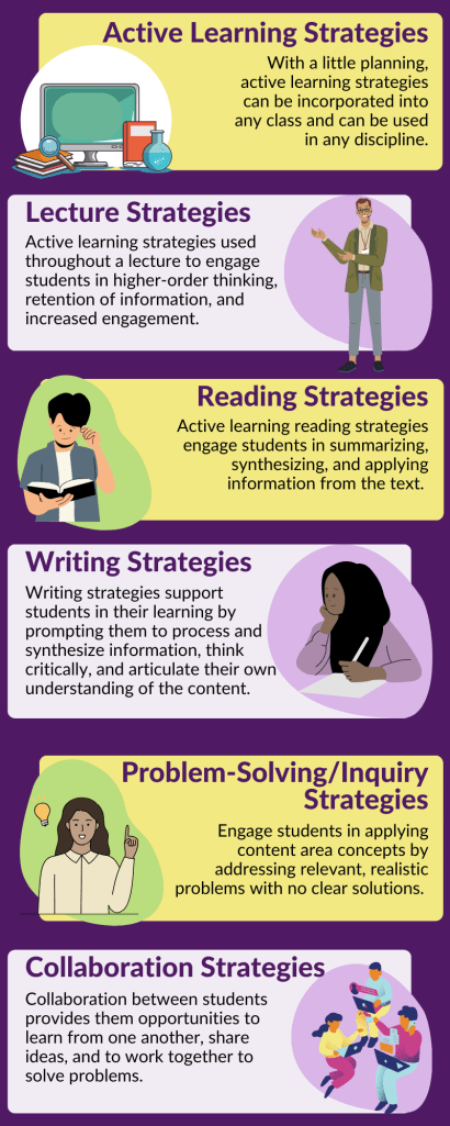
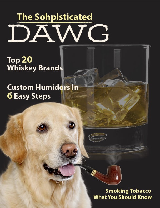
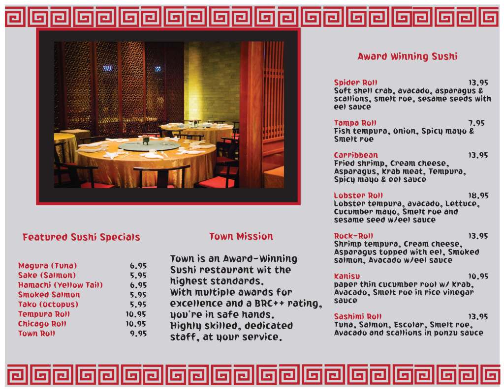
A department newsletter designed to share a large number of upcoming event dates and details in a clear, engaging format. This project was a unique challenge due to the amount of text required, but I balanced layout and design to keep it visually appealing and easy to read. The newsletter was produced both in print and digital formats, with the digital version featuring shortened links for easier access.A flyer I designed to promote a student and faculty event hosted by our department and held on the university campus. To ensure consistency, I used Saint Leo University’s brand marketing colors and guidelines while creating a layout that remained visually appealing and engaging. Since the event was also offered online, one of the featured images was selected to represent online students and highlight the inclusive nature of the event.This design was a large poster created for the Historic Downtown Sandpoint, Idaho shopping district. The project was particularly challenging because it required fitting many necessary elements into one cohesive layout while keeping the design visually appealing. Since the event was titled Spring Fling with the tagline “Shop, Hop and Win,” I chose to highlight one of the artist’s paintings of a bunny alongside another piece of her work to emphasize the spring theme. The poster also included all event details, the names of participating businesses along the bottom, a QR code for quick access to more information, and the sponsor’s logo to recognize event support. Despite the large amount of text and required content, I feel the final design came together beautifully, and most importantly, the customer was thrilled with the result.This postcard was created for the same Spring Fling event and needed to carry over the same required elements as the poster and flyer, excluding the participating business names. The design had to remain consistent with the larger campaign materials while fitting all of the event information onto a much smaller format. Balancing readability with visual appeal on a postcard was a challenge, but the final result successfully matched the event branding and delivered the information clearly.This poster was created for the Historic Downtown Sandpoint, Idaho shopping district to promote a St. Patrick’s Day event. The design incorporated a festive St. Patrick’s motif with varying shades of green, decorative elements, and one of the title fonts chosen to best represent Irish culture. The poster needed to include detailed instructions for the leprechaun scavenger hunt with a clover, information about prizes, entry and drawing details, as well as a long list of affiliated shops. It also featured the event logo, which I had designed months earlier. Despite the amount of required text and elements, I ensured the poster remained readable, visually appealing, and consistent with the event’s festive theme. Most importantly, the client was very pleased with the final design.This flyer was created to accompany the St. Patrick’s Day event for the Historic Downtown Sandpoint, Idaho shopping district. Designed to match the overall event branding, the flyer included a 10% off voucher with instructions on how to redeem it, a QR code, and detailed directions for the leprechaun scavenger hunt. It also featured the image of the leprechaun with the clover that customers needed to find throughout the shopping district, along with the full list of participating business names. Despite the large amount of required content, I ensured the design remained clear, readable, and visually appealing while staying consistent with the event’s festive theme.This postcard was created for an ongoing annual campaign hosted by our department called Thank a Professor, which invites students to send notes of gratitude to their professors. For this design, I chose a whimsical, retro-inspired illustration of a teacher character pointing to a chalkboard, which displayed all of the campaign details along with a QR code. To complement the character, I used a color palette of soft browns, burnt oranges, and creams, giving the design a warm and approachable feel. I also incorporated our department logo and framed the QR code with an apple graphic as a playful nod to the classroom theme.This flyer was created for the Thank a Professor campaign after a few years of refining the message we wanted to communicate. By this time, the university had introduced stricter brand marketing requirements, so the design needed to follow Saint Leo University’s guidelines closely. It also highlights my shift toward a cleaner, simpler layout style, reflecting both the clearer campaign message and the branding standards we were asked to uphold.This flyer was created for the Thank a Professor initiative the year prior. For this design, I incorporated Saint Leo University brand colors while continuing the theme of classroom elements. An apple graphic was used to frame the QR code, and a ruler element outlined the “Show Your Gratitude” tagline, tying the design back to the campaign’s focus on education and appreciation.This flyer was created for the first year of the Thank a Professor initiative. At the request of the Associate Vice President, I used bright colors to grab attention, choosing a bold yellow background that paired well with a central apple graphic holding the QR code. The side borders were designed to resemble the edges of a paper tablet, reinforcing the classroom theme. Over the years, the designs for this initiative have evolved and improved as the event manager provided more details and refined the overall message, allowing me to create visuals that more effectively capture the spirit of the campaign.This is the cover for our department’s Annual Report, a lengthy publication that highlights our initiatives, events, website, and key statistics. I will include a link to the webpage so it can be viewed. For this year’s report, I chose to create a cleaner overall design while incorporating more effective infographics to present complex data in a clear and engaging way. Over the years, these reports have reflected my growth and refinement in layout design. My Associate Vice President was particularly pleased with this year’s design, calling it the best yet. She shared it with our Vice President, who was so impressed that he had 16 bound copies printed and distributed to the university president and board members.. https://faculty.saintleo.edu/annual-report/The 2023–2024 Annual Report was created as a web-based design rather than a traditional print piece, though it can still be downloaded as a PDF from the website. I used Saint Leo University’s brand colors along with accent colors to make graphs, quotes, and other key elements stand out. Since this was not a typical page on our website, I had more flexibility to experiment with different widgets that showcased the site’s capabilities, added visual interest, and helped break up the heavy amount of text these reports require. This approach gave the report a more dynamic, engaging feel. Looking back, I would have chosen a white background for a cleaner overall look, but the project demonstrates the ongoing evolution of my work and my commitment to continually refining and improving my designs.In 2022 and 2023, I was asked to incorporate more images of our team and faculty throughout the Annual Report to make it feel less text heavy. I approached the design with a cleaner look, adding photos, graphical elements, and infographics to break up the content and improve readability. Looking back, I feel the design worked well for its purpose, but as a designer, there’s always the instinct to refine and improve. These reports reflect the ongoing evolution of my skills and my commitment to growing as a visual communicator.The 2021 and 2022 reports marked my first time creating the Annual Report. At the time, we had no action images available to incorporate, but my Associate Vice President emphasized the need to use graphics to help balance and break up the lengthy text. The final design was clean and well-aligned, but looking back, I recognize that I may have been overly enthusiastic with the amount of graphics included. Many could have been reduced while still effectively breaking up the text and avoiding a monotonous layout. This early project represents an important stage in my design journey, showing how my approach has matured and become more refined over time.This flyer was created for Choose Wellness, an event sponsored by our department to promote various wellness groups across the university. The design incorporated images, icons, and a header featuring soothing stacked rocks to visually represent the theme of wellness, with the event title placed prominently above. Required elements included a QR code, our department logo, and a URL for the event. While I feel the design communicated the message effectively, I can always see opportunities to refine and improve.This flyer was created for another department at Saint Leo University. The department selected the colors and requested an “out of this world” theme, which I conveyed by using a black background with a group of faint star-like elements to create depth. To make the content stand out, I used light yellow font for contrast and a bold header font to grab attention. Since no images were requested for this project, I relied on strong typography and color choices to create visual impact and maintain the desired theme.This infographic was designed as a handout for a lecture on Active Learning Strategies. To improve readability, I broke up the text by placing it over alternating blocks of two subtle colors, helping the reader follow each step more clearly. A dark purple background was used to make the lighter pastel tones pop and give the design a brighter, more engaging feel. I also added character illustrations and thematic icons to represent each section of text, reinforcing the content and making the layout more visually appealing.This project was a school assignment to design the front page of a magazine, following specific dimensions and requirements. I created The Pampered Pooch, featuring a white and gray pit bull with a pacifier, teddy bears, and a nursery background. To reinforce the theme, I added lipstick kiss marks on the dog and laid out the design like a real magazine cover with article highlights. I used bright pink sparingly, applying it to single words or numbers in the article titles to make them stand out against the pale blue background. I experimented with multiple font styles, and while I can now see areas for improvement with font consistency and kerning, I am especially proud of the image work, as I hand-built the composition by adding each element myself, including the pacifier, teddy bears, and kiss marks. This was one of my first attempts at magazine design, created entirely by hand before AI tools were available. The piece earned strong positive feedback from my peers.This project was the second magazine cover layout I created for class, titled DAWG. For this design, I aimed for a more sophisticated, masculine look that mimicked the style of a gentleman’s magazine. The layout featured a black background with a large, muted glass of whiskey on the rocks and a labrador positioned on the front left smoking a pipe, with a waft of smoke rising from it. I improved my typography choices in this layout, using cleaner fonts for the article titles and soft yellow highlights on select words and numbers to stand out against the dark background. At the time, I struggled with making the pipe look natural in the dog’s mouth, and looking back, I would refine it further with shading and better positioning. Still, for a student project, I feel this piece successfully captured the theme and showed growth from my first magazine cover.This trifold was created for a Japanese restaurant specializing in sushi. On the inside fold, I used images of the restaurant that intentionally flowed across two panels to create a seamless visual effect. The front featured sushi images on each fold, paired with a font and border designs inspired by traditional oriental art to reinforce the theme. I also incorporated the restaurant’s brand marketing colors and logo, Town. Looking back, I see areas where the design could be improved. In one section, I placed black text on a red box, which does not provide strong enough contrast for readability, especially for those with visual impairments. I also used a gray background across the entire trifold, but if I were to redesign it, I would switch to a white background for improved clarity and readability, while incorporating the gray brand color more selectively as an accent or highlight.Inside Tri fold menu