
A selection of my web design projects that focus on accessibility, usability, and brand alignment. Each project reflects my growth as a designer and communicator, balancing creativity with consistency, and functionality with institutional identity.
Center for Teaching and Learning Excellence (CTLE) Website Redesign
Saint Leo University
Overview
As the Digital Communications Project Manager at Saint Leo University, I have managed and designed content for the Center for Teaching and Learning Excellence (CTLE) website for the past four years. The CTLE site is an independent, 300+ page resource hub serving faculty and staff across the university.
I oversee every aspect of content organization and design, including updating information, creating new pages, and redesigning existing layouts to improve usability and accessibility. I also collaborate with other departments to feature their content, ensuring it is clearly structured, accessible, and aligned with Saint Leo’s mission.
While our department has creative flexibility, I intentionally follow the university’s official brand guidelines for color, typography, and layout to maintain a cohesive, professional identity across all CTLE pages.
Visit the Center for Teaching and Learning Excellence Website
Design Approach
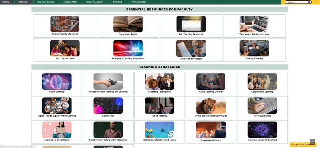
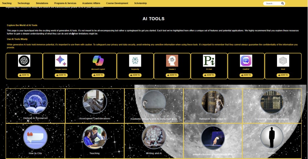
In Summer 2025, I led a full redesign of the CTLE website to modernize its structure, unify the user experience, and enhance accessibility. The redesign included complete overhauls of several major sections — the Teaching page, the AI Resource Hub, and the Adjunct Teaching Hub.
My design process is continuous and feedback-driven. Our department conducts surveys each semester to gather input from faculty and staff about the CTLE website, and I carefully review that feedback to identify areas for improvement. Based on this input, I regularly refine layouts, reorganize content, and update visual elements to ensure the site remains clear, current, and responsive.
This ongoing process focuses on three key goals:
- Clarity: Organize information logically so faculty can find what they need quickly.
- Consistency: Apply uniform design elements, spacing, and font styles for a cohesive experience across all pages.
- Accessibility: Maintain a calm, readable layout with proper contrast, responsive design, and ADA-compliant structure for all users.
By combining user feedback with accessibility and brand alignment, I’ve developed a dynamic, evolving website that reflects both Saint Leo University’s identity and the needs of its community.
Featured Page Redesign: Teaching Page
Teaching Landing Page


Additional Page Redesigns
AI Resource Hub

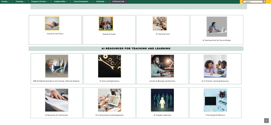
Technology Landing Page
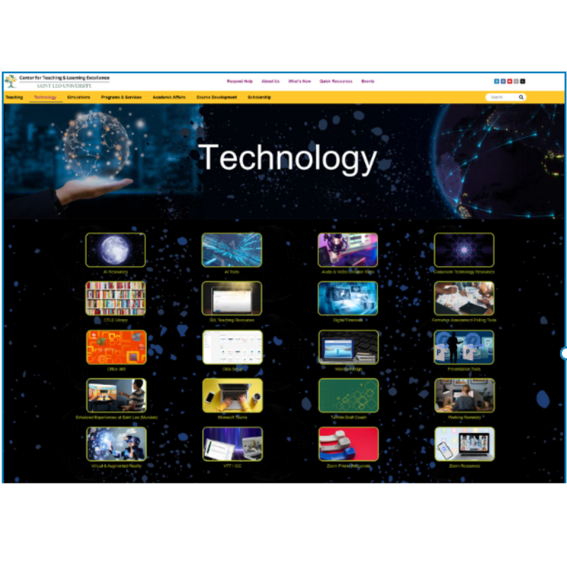
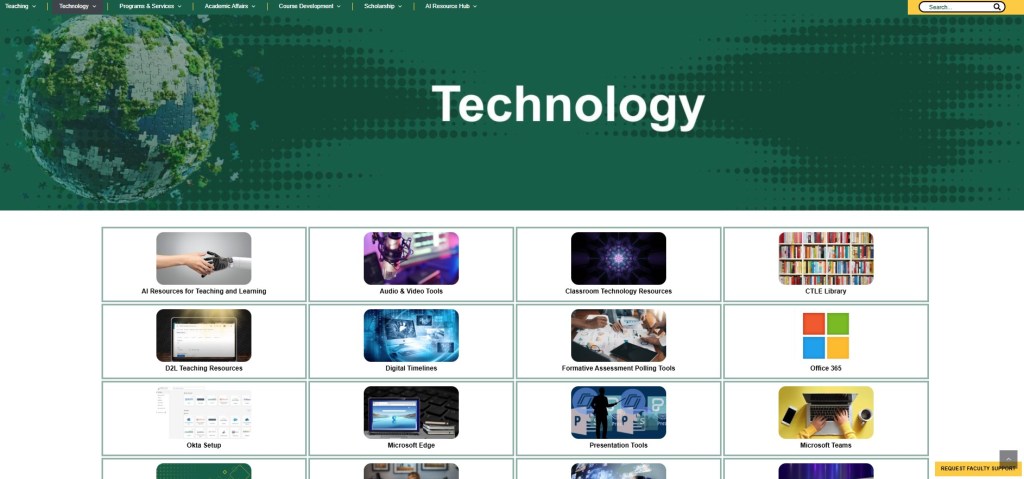
In the next phase, I plan to incorporate organized categories—similar to those used on the Teaching and AI Resource pages—to make information even easier for faculty to find and engage with.
Reflection
This project represents a major milestone in my professional growth as a digital designer and project manager. Managing the CTLE website over the past four years has taught me the importance of accessibility, feedback, and design consistency. Through ongoing collaboration, user surveys, and iterative redesigns, I’ve developed a refined understanding of how to balance brand identity with user-centered design. The CTLE website now offers a cohesive, responsive, and inclusive experience that supports faculty success and reflects Saint Leo University’s core values.
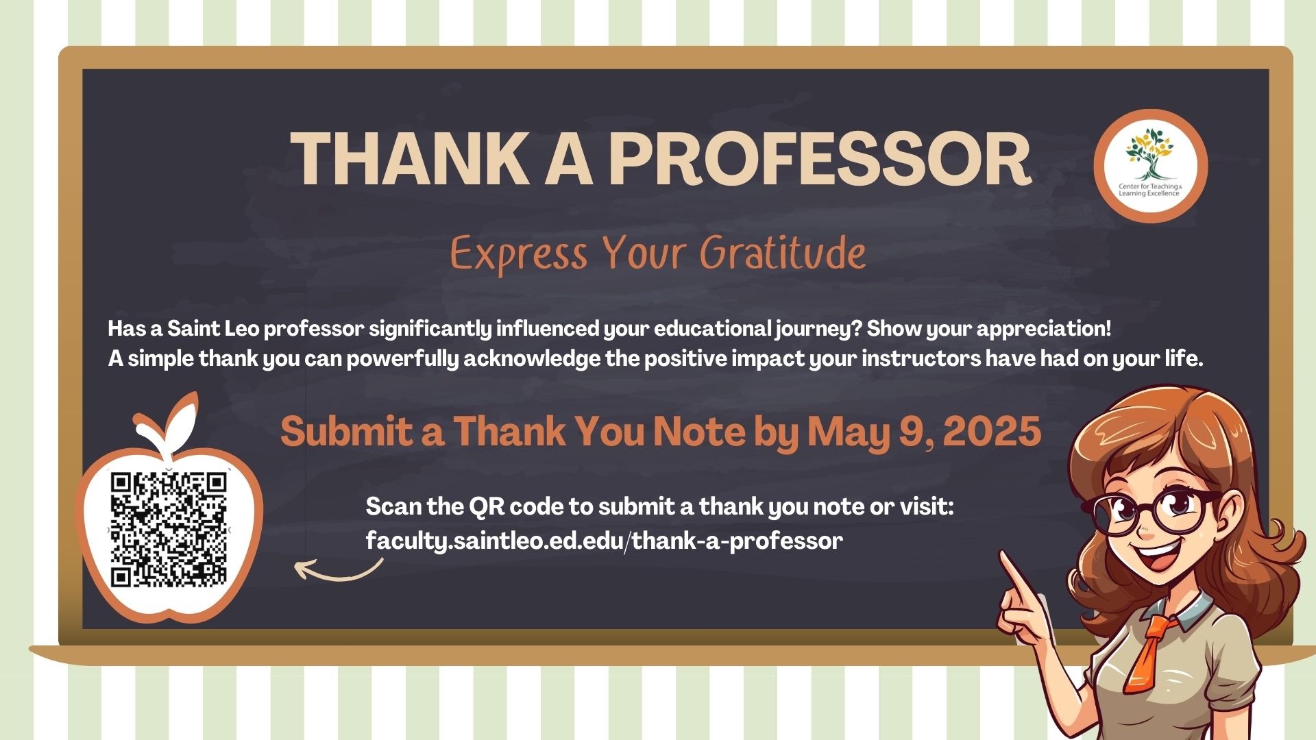
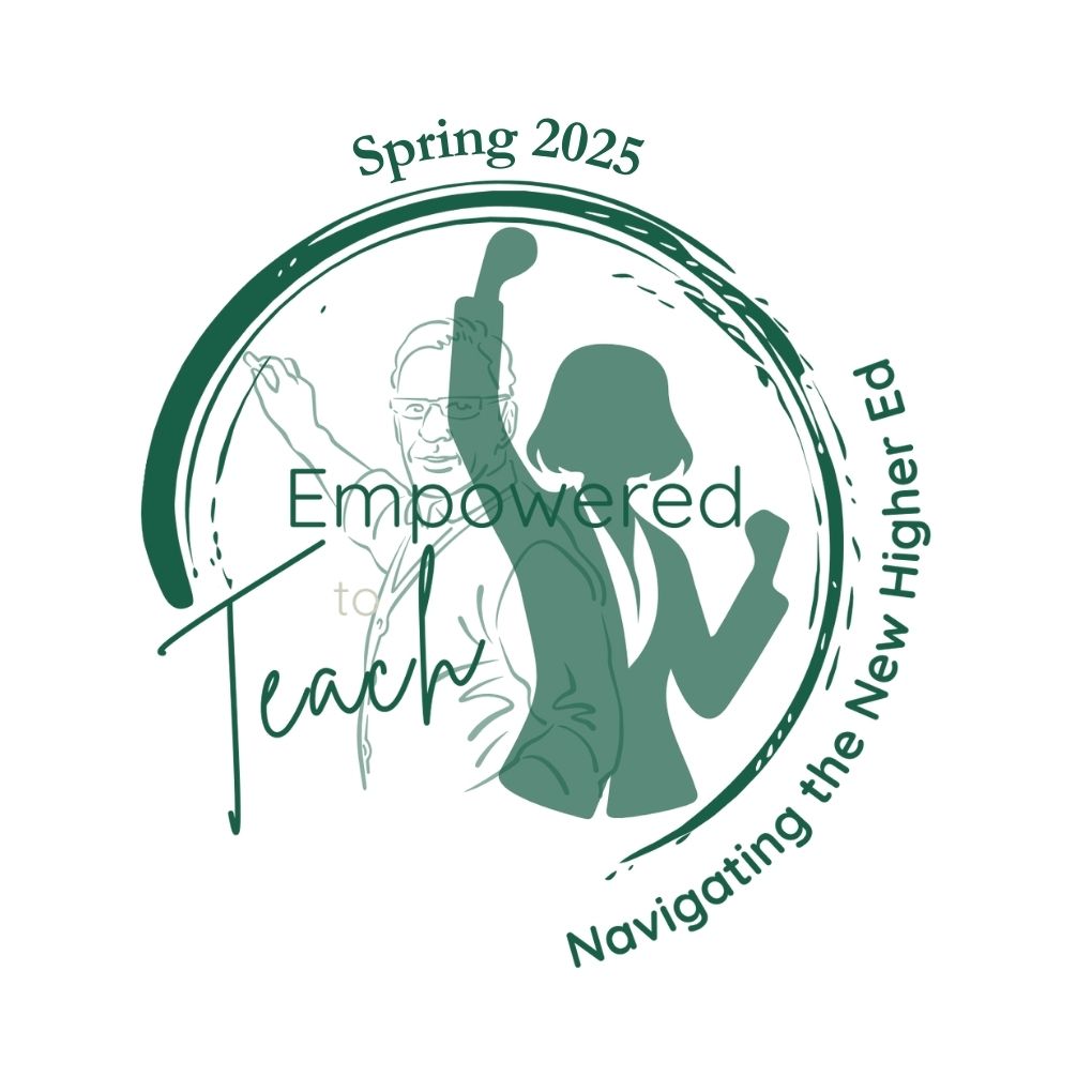
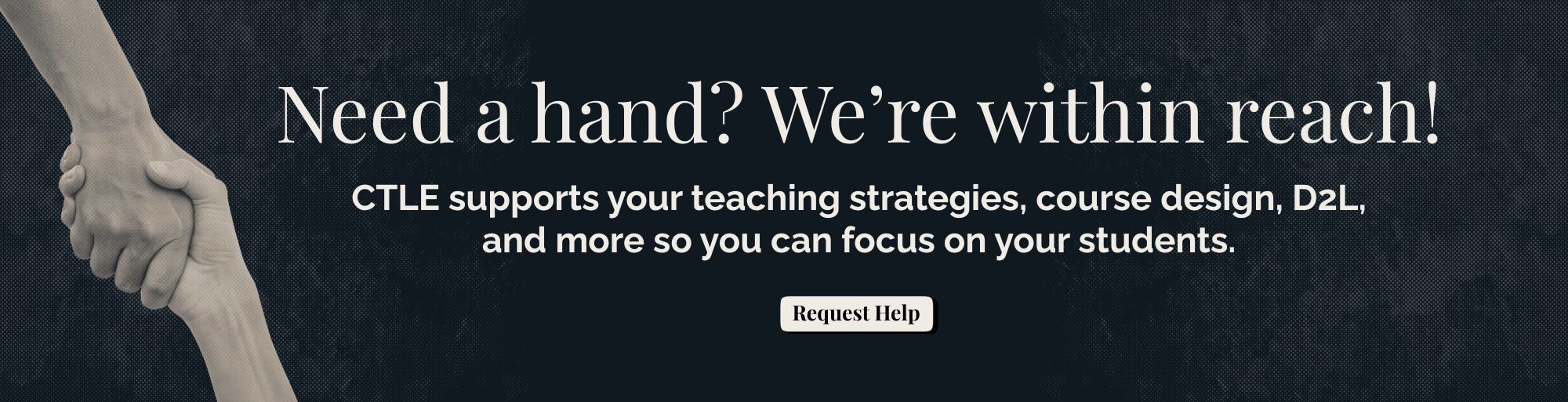
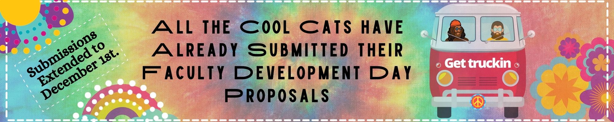
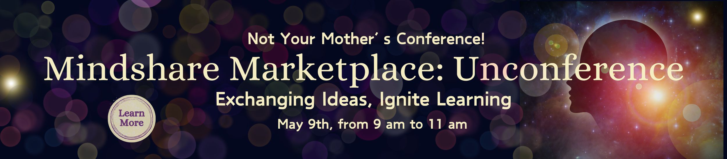
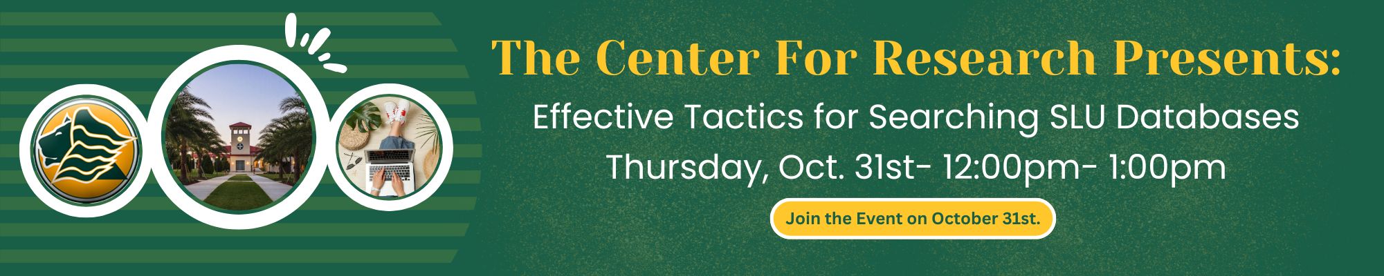
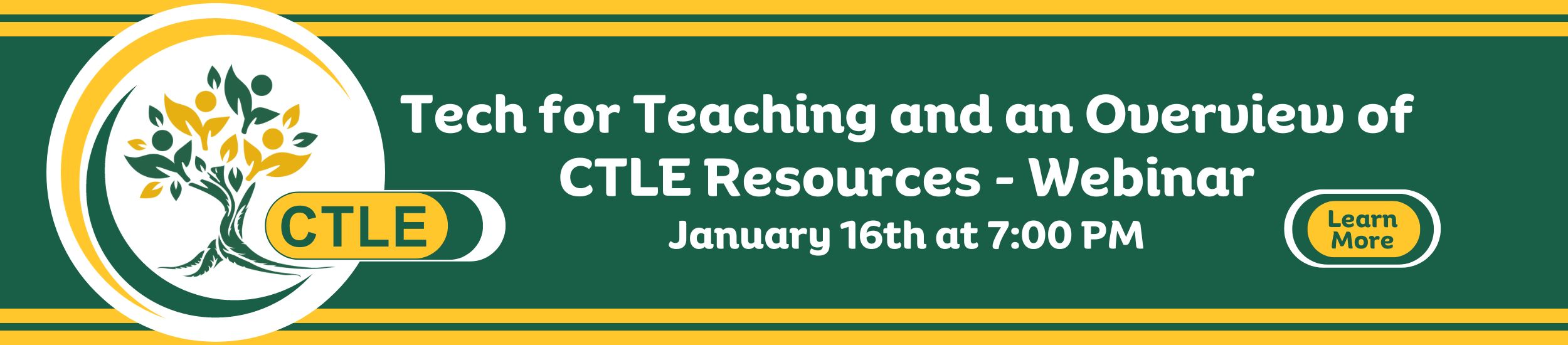
Digital Media-Web Banners
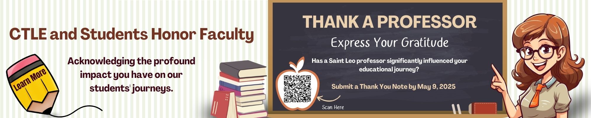
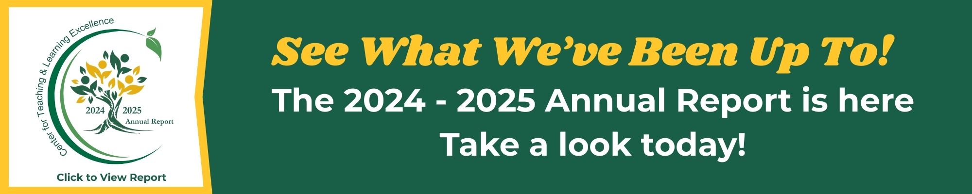
A collection of digital web banners I’ve created for the Center for Teaching and Learning Excellence (CTLE) website over the past four years. These banners appear on the CTLE landing page to promote upcoming events, programs, and university-wide initiatives.
Unlike the core CTLE website, which follows Saint Leo University’s formal brand standards, these banners are designed to capture attention and engage viewers. Each one is tailored to the event’s theme and audience, using creative combinations of color, typography, and imagery to make information stand out while remaining clear and accessible. I carefully consider font pairings, contrast, and readability to ensure that all designs meet accessibility standards.
The examples below represent a range of styles and tones, reflecting my ability to design dynamic visuals that both attract attention and communicate effectively within a diverse university community.


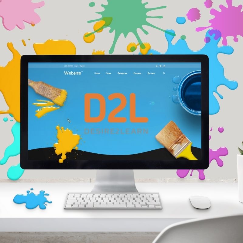
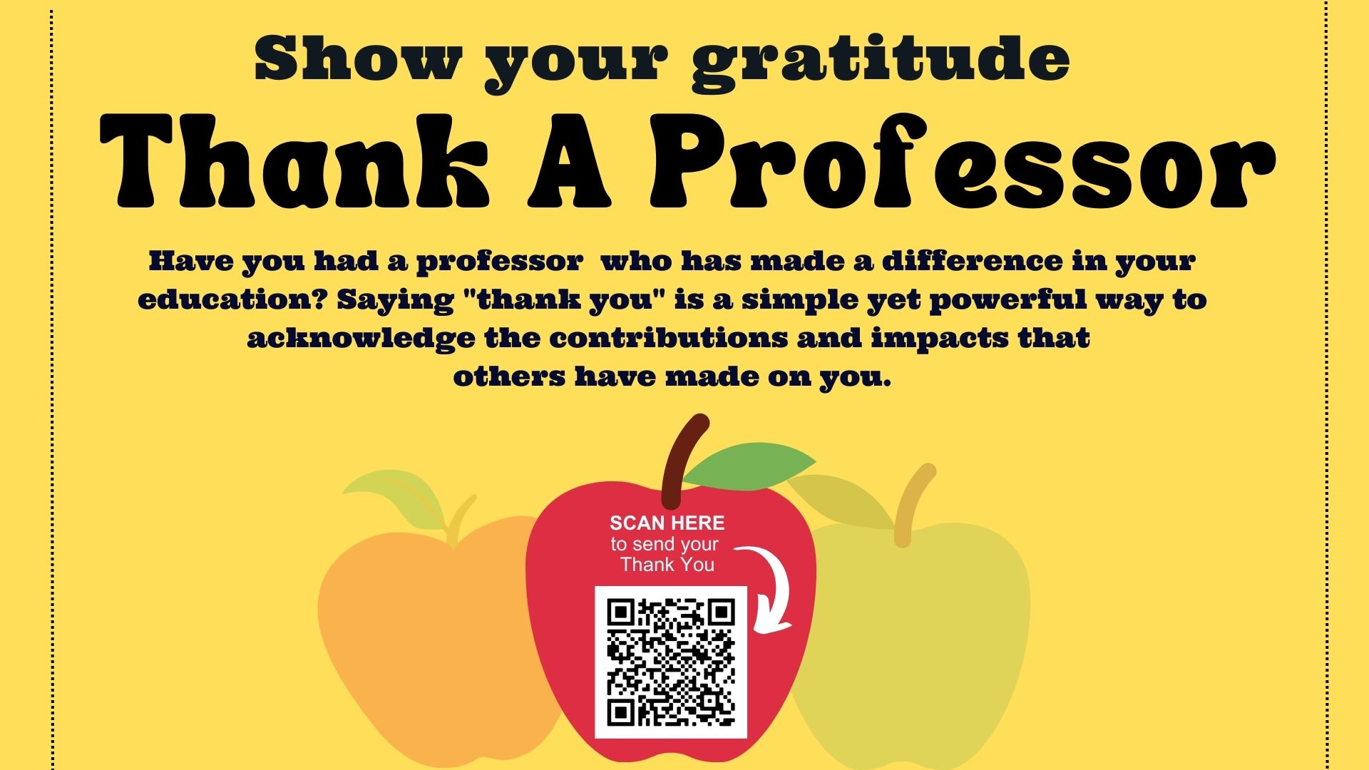
Digital Media-Web Images
A selection of custom web graphics I’ve designed for the Center for Teaching and Learning Excellence (CTLE) website. These images are used across the site and in related campaigns to promote webinars, special events, and faculty initiatives.
Unlike the core CTLE pages, which follow Saint Leo University’s brand standards, these visuals are designed to capture attention and encourage engagement. Each piece is created with a specific message and audience in mind, often using distinctive color palettes, typography, and imagery to convey the theme of the event or campaign.
The images vary in size and purpose—from homepage features to smaller promotional graphics used in email campaigns and resource hubs. While each design is unique, I always consider accessibility, legibility, and visual balance to ensure clarity and impact across all formats.
The examples below showcase the variety and adaptability of my digital design work, highlighting how I create visuals that not only stand out but also communicate effectively in a busy digital environment.